
KEVIN.MURPHY BLOW.DRY line
Designing packaging for a range of off-white bottles presented a unique challenge: ensuring quick product recognition in fast-paced salon settings. We addressed this by introducing distinctive side icons, helping stylists identify products at a glance.
While each bottle features its own Pantone color, we unified the product titles, icons, and spray tops in black to maintain cohesion and strengthen the visual identity. The bottle’s distinctive shape and limited print area guided our approach, resulting in a refined icon system that balances practicality with the brand’s aesthetic.
Creative Direction - Larry Paul
Art Direction - Briana Espinosa
Graphic Design - Martyna Marcenkovaite
Product Photography - Paul Tillinghast
Product Photography Styling - Andrew Spargo

LIFT / SMOOTH / BOUNCE / THICKEN
These icons not only serve as quick identifiers but also reinforce the product's unique styling function through visual metaphor. LIFT is represented by an arch-like shape suggesting upward motion, SMOOTH by evenly spaced vertical lines for sleek control, BOUNCE by dynamic curves echoing energy and movement, and THICKEN by radiating lines that evoke volume and expansion. The consistent line weight and black color unify the set while preserving their distinct identities.


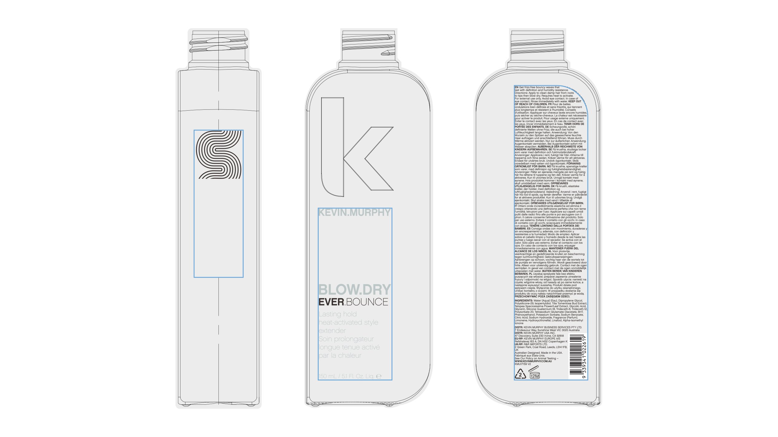
Working with uniquely shaped bottles like this one, I was challenged to adapt the concept to fit within strict production limitations. The icon shapes were carefully designed to stay within the vendor-defined safe area (marked by the blue line) which ensures all printed elements remain clearly visible and undistorted. Despite these constraints, the final design feels deliberate and cohesive, seamlessly integrating form and function.


Credits:
Creative Direction - Kevin Murphy & Larry Paul
Model Photography & Video - John O'Rourke & Reuben Gates
Still Life Art Direction - Briana Espinosa
Still Life Photography - Paul Tillinghast
Still Life Styling - Andrew Spargo
Graphic Design - Martyna Marcenkovaite